library(tidyverse)# result <- read.csv(file = 'total_elements_mindat.csv')mineral <-read.csv(file ='mineral.csv')# result <- read.csv(file = 'total_elements_mindat.csv')# df_72 <- read.csv(file = 'hardness.csv')df_30 <-read.csv(file ='hardness_30.csv')
Expressiveness and Effectiveness
Corrected Version
Code
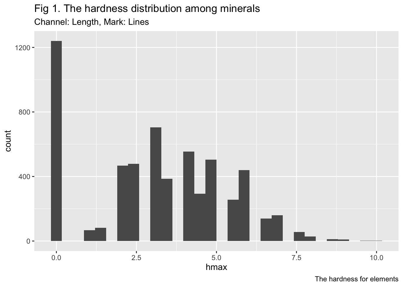
# head(df_30)# # ggplot(df_30, aes(x=elements, y=X)) +# ggplot(df_30, aes(x=factor(elements, level=elements), y=hmax)) +# geom_point(size=2) + # labs(title = "Fig 1. Expressiveness and Effectiveness",# subtitle = "Plot of element hardness by length",# caption = "The hardness for elements")# head(mineral)ggplot(mineral, aes(x=hmax)) +geom_histogram()+labs(title ="Fig 1. The hardness distribution among minerals",subtitle ="Channel: Length, Mark: Lines",caption ="The hardness for elements")
`stat_bin()` using `bins = 30`. Pick better value with `binwidth`.
Code
# # Change the width of bins# ggplot(mineral, aes(x=hmax)) +# geom_histogram(binwidth=1)# # Change colors# p<-ggplot(mineral) +# geom_histogram(color="black", fill="white")# p
Wrong Version
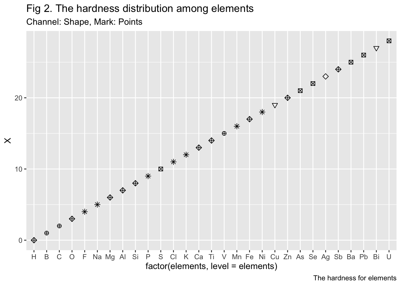
Our main theme is about the hardness of minerals. To best demonstrate the characteristic of our elements list, I choose to visualize the index of the elements.
Code
# head(df_30)# ggplot(df_30, aes(x=elements, y=X)) +# ggplot(df_30, aes(x=factor(elements, level=elements), y=X)) +# geom_point(size=2, shape=as.integer(df_30$X)) + # labs(title = "Fig 2. The hardness distribution among minerals",# subtitle = "Plot of elements by shapes",# caption = "The hardness for elements")ggplot(df_30, aes(x=factor(elements, level=elements), y=X)) +geom_point(size=2, shape=as.integer(df_30$hmax)) +labs(title ="Fig 2. The hardness distribution among elements",subtitle ="Channel: Shape, Mark: Points",caption ="The hardness for elements")
Discriminability
Corrected Version
Code
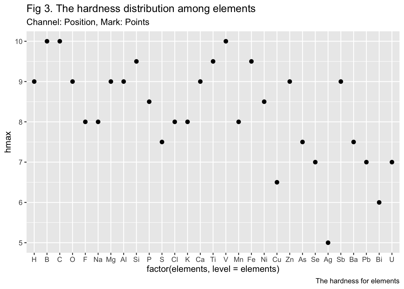
#head(df_30)# ggplot(df_30, aes(x=elements, y=X)) +ggplot(df_30, aes(x=factor(elements, level=elements), y=hmax)) +geom_point(size=2) +labs(title ="Fig 3. The hardness distribution among elements",subtitle ="Channel: Position, Mark: Points",caption ="The hardness for elements")
Wrong Version
Code
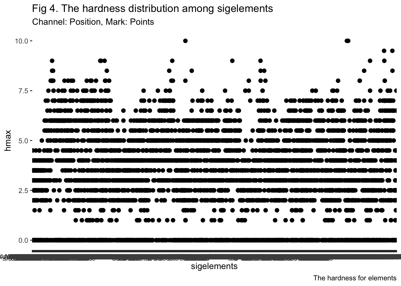
ggplot(mineral, aes(x=sigelements, y=hmax)) +geom_point(size=2) +labs(title ="Fig 4. The hardness distribution among sigelements",subtitle ="Channel: Position, Mark: Points",caption ="The hardness for elements")
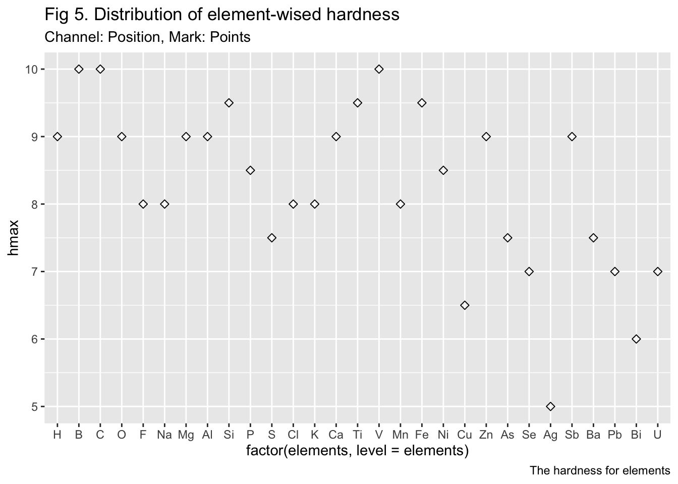
Separability
Corrected Version
Code
ggplot(df_30, aes(x=factor(elements, level=elements), y=hmax)) +geom_point(size=2, shape=23) +labs(title ="Fig 5. Distribution of element-wised hardness",subtitle ="Channel: Position, Mark: Points",caption ="The hardness for elements")
Code
#scale_y_continuous(trans='log2')
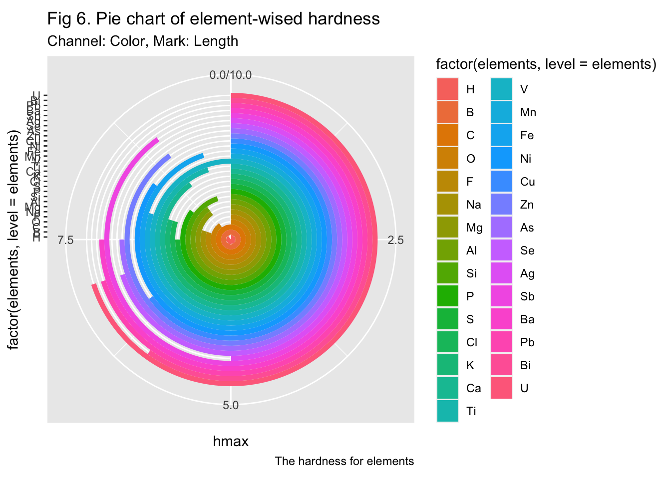
Wrong Version
We noticed that the values of ‘hmin’ are too small to tell, so we amplified it by applying exponential transform.
Code
# ggplot(df_30, aes(x=elements, y=hmax)) +# geom_point(size=2, shape=23) + # labs(title = "Separability",# subtitle = "Plot of element hardness with exponential transform on hmin.",# caption = "The hardness for elements")# #scale_y_continuous(trans='log2')# Basic piechartggplot(df_30, aes(x=factor(elements, level=elements), y=hmax, fill=factor(elements, level=elements))) +geom_bar(stat="identity", width=1) +coord_polar("y", start=0) +labs(title ="Fig 6. Pie chart of element-wised hardness",subtitle ="Channel: Color, Mark: Length",caption ="The hardness for elements")
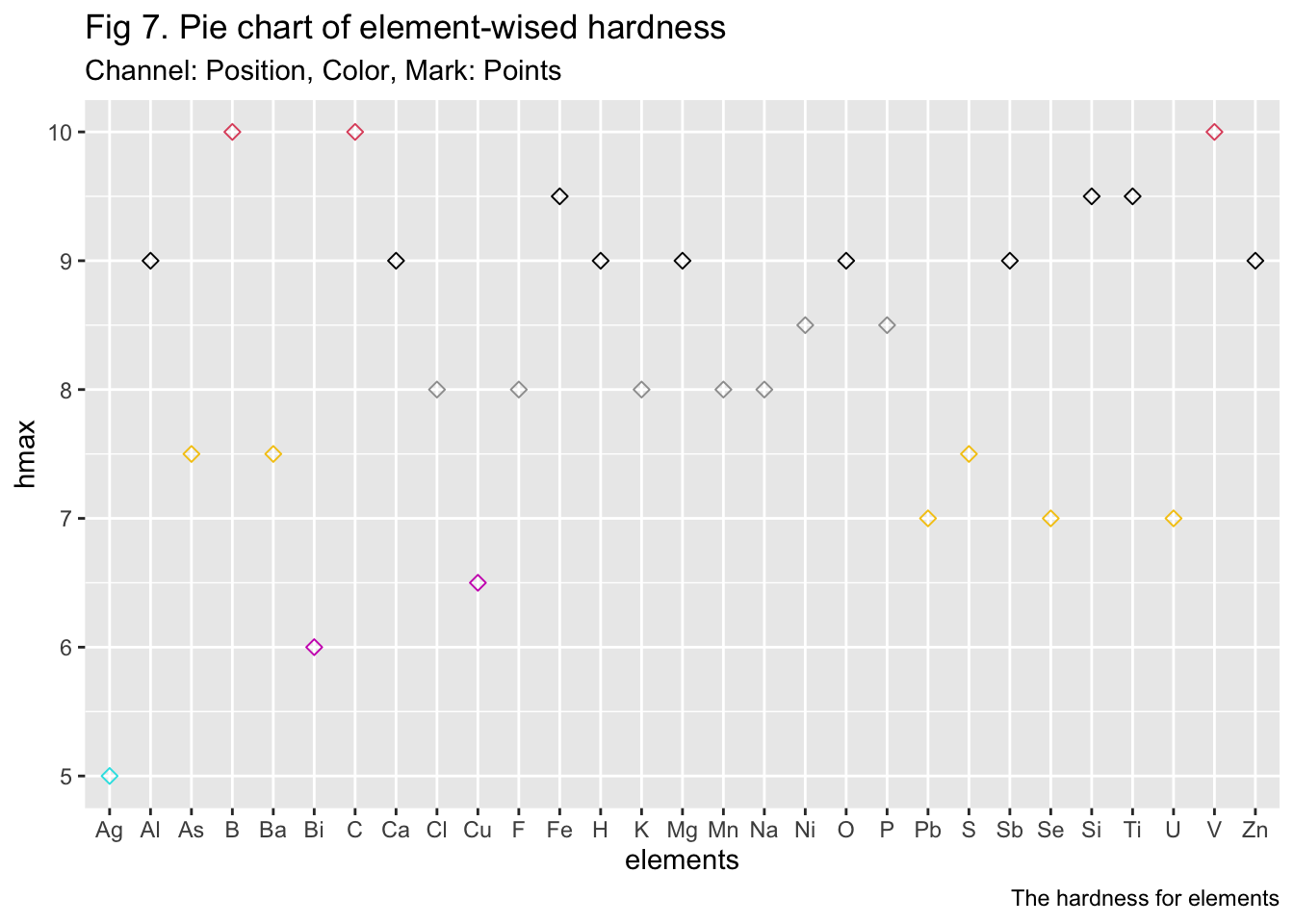
Popout
Corrected Version
Code
ggplot(df_30, aes(x=elements, y=hmax)) +geom_point(size=2, shape=23, colour =factor(as.integer(df_30$hmax))) +labs(title ="Fig 7. Pie chart of element-wised hardness",subtitle ="Channel: Position, Color, Mark: Points",caption ="The hardness for elements")
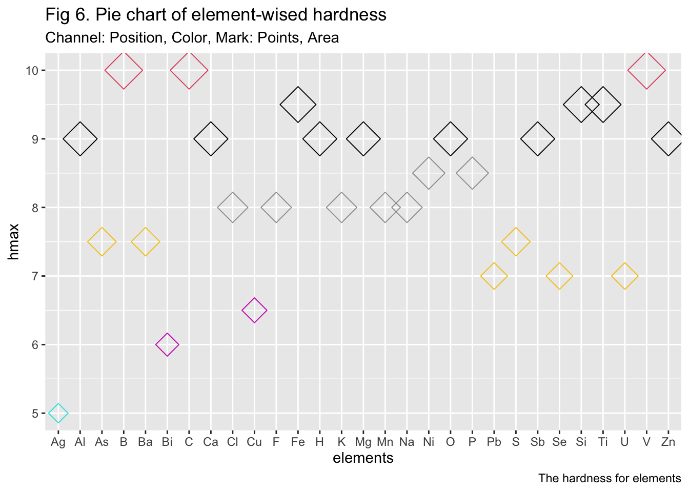
Wrong Version
Nothing can be more striking than the areas of the scatters. And guess what? We will also add some colors to make it as eye-catching as rainbow!
Code
ggplot(df_30, aes(x=elements, y=hmax)) +geom_point(size=df_30$hmax, shape=23, colour =factor(as.integer(df_30$hmax))) +labs(title ="Fig 6. Pie chart of element-wised hardness",subtitle ="Channel: Position, Color, Mark: Points, Area",caption ="The hardness for elements")
Source Code
---title: "Assignment 4"author: "Jiyin Zhang"subtitle: "Marks and Channels"date: "2023-02-16"categories: [Assignment, DataViz]image: shiny_shit.jpgcode-fold: truecode-tools: truedescription: "A clever description that describes the stuff"format: html---## Import data ```{r}#| code-fold: true#| code-summary: "Code"#| output: falselibrary(tidyverse)# result <- read.csv(file = 'total_elements_mindat.csv')mineral <-read.csv(file ='mineral.csv')# result <- read.csv(file = 'total_elements_mindat.csv')# df_72 <- read.csv(file = 'hardness.csv')df_30 <-read.csv(file ='hardness_30.csv')```## Expressiveness and Effectiveness### Corrected Version```{r}# head(df_30)# # ggplot(df_30, aes(x=elements, y=X)) +# ggplot(df_30, aes(x=factor(elements, level=elements), y=hmax)) +# geom_point(size=2) + # labs(title = "Fig 1. Expressiveness and Effectiveness",# subtitle = "Plot of element hardness by length",# caption = "The hardness for elements")# head(mineral)ggplot(mineral, aes(x=hmax)) +geom_histogram()+labs(title ="Fig 1. The hardness distribution among minerals",subtitle ="Channel: Length, Mark: Lines",caption ="The hardness for elements")# # Change the width of bins# ggplot(mineral, aes(x=hmax)) +# geom_histogram(binwidth=1)# # Change colors# p<-ggplot(mineral) +# geom_histogram(color="black", fill="white")# p```### Wrong VersionOur main theme is about the hardness of minerals. To best demonstrate the characteristic of our elements list, I choose to visualize the index of the elements.```{r}# head(df_30)# ggplot(df_30, aes(x=elements, y=X)) +# ggplot(df_30, aes(x=factor(elements, level=elements), y=X)) +# geom_point(size=2, shape=as.integer(df_30$X)) + # labs(title = "Fig 2. The hardness distribution among minerals",# subtitle = "Plot of elements by shapes",# caption = "The hardness for elements")ggplot(df_30, aes(x=factor(elements, level=elements), y=X)) +geom_point(size=2, shape=as.integer(df_30$hmax)) +labs(title ="Fig 2. The hardness distribution among elements",subtitle ="Channel: Shape, Mark: Points",caption ="The hardness for elements")```## Discriminability### Corrected Version```{r}#head(df_30)# ggplot(df_30, aes(x=elements, y=X)) +ggplot(df_30, aes(x=factor(elements, level=elements), y=hmax)) +geom_point(size=2) +labs(title ="Fig 3. The hardness distribution among elements",subtitle ="Channel: Position, Mark: Points",caption ="The hardness for elements")```### Wrong Version```{r}ggplot(mineral, aes(x=sigelements, y=hmax)) +geom_point(size=2) +labs(title ="Fig 4. The hardness distribution among sigelements",subtitle ="Channel: Position, Mark: Points",caption ="The hardness for elements")```## Separability### Corrected Version```{r}ggplot(df_30, aes(x=factor(elements, level=elements), y=hmax)) +geom_point(size=2, shape=23) +labs(title ="Fig 5. Distribution of element-wised hardness",subtitle ="Channel: Position, Mark: Points",caption ="The hardness for elements")#scale_y_continuous(trans='log2')```### Wrong VersionWe noticed that the values of 'hmin' are too small to tell, so we amplified it by applying exponential transform.```{r}# ggplot(df_30, aes(x=elements, y=hmax)) +# geom_point(size=2, shape=23) + # labs(title = "Separability",# subtitle = "Plot of element hardness with exponential transform on hmin.",# caption = "The hardness for elements")# #scale_y_continuous(trans='log2')# Basic piechartggplot(df_30, aes(x=factor(elements, level=elements), y=hmax, fill=factor(elements, level=elements))) +geom_bar(stat="identity", width=1) +coord_polar("y", start=0) +labs(title ="Fig 6. Pie chart of element-wised hardness",subtitle ="Channel: Color, Mark: Length",caption ="The hardness for elements")```## Popout### Corrected Version```{r}ggplot(df_30, aes(x=elements, y=hmax)) +geom_point(size=2, shape=23, colour =factor(as.integer(df_30$hmax))) +labs(title ="Fig 7. Pie chart of element-wised hardness",subtitle ="Channel: Position, Color, Mark: Points",caption ="The hardness for elements")```### Wrong VersionNothing can be more striking than the areas of the scatters. And guess what? We will also add some colors to make it as eye-catching as rainbow!```{r}ggplot(df_30, aes(x=elements, y=hmax)) +geom_point(size=df_30$hmax, shape=23, colour =factor(as.integer(df_30$hmax))) +labs(title ="Fig 6. Pie chart of element-wised hardness",subtitle ="Channel: Position, Color, Mark: Points, Area",caption ="The hardness for elements")```